Brand
Usetheswarm.
Loghi, icone, colori e regole per usare il brand Swarmz dentro documentazione, presentazioni, siti dei partner e ovunque compaia il nostro marchio.
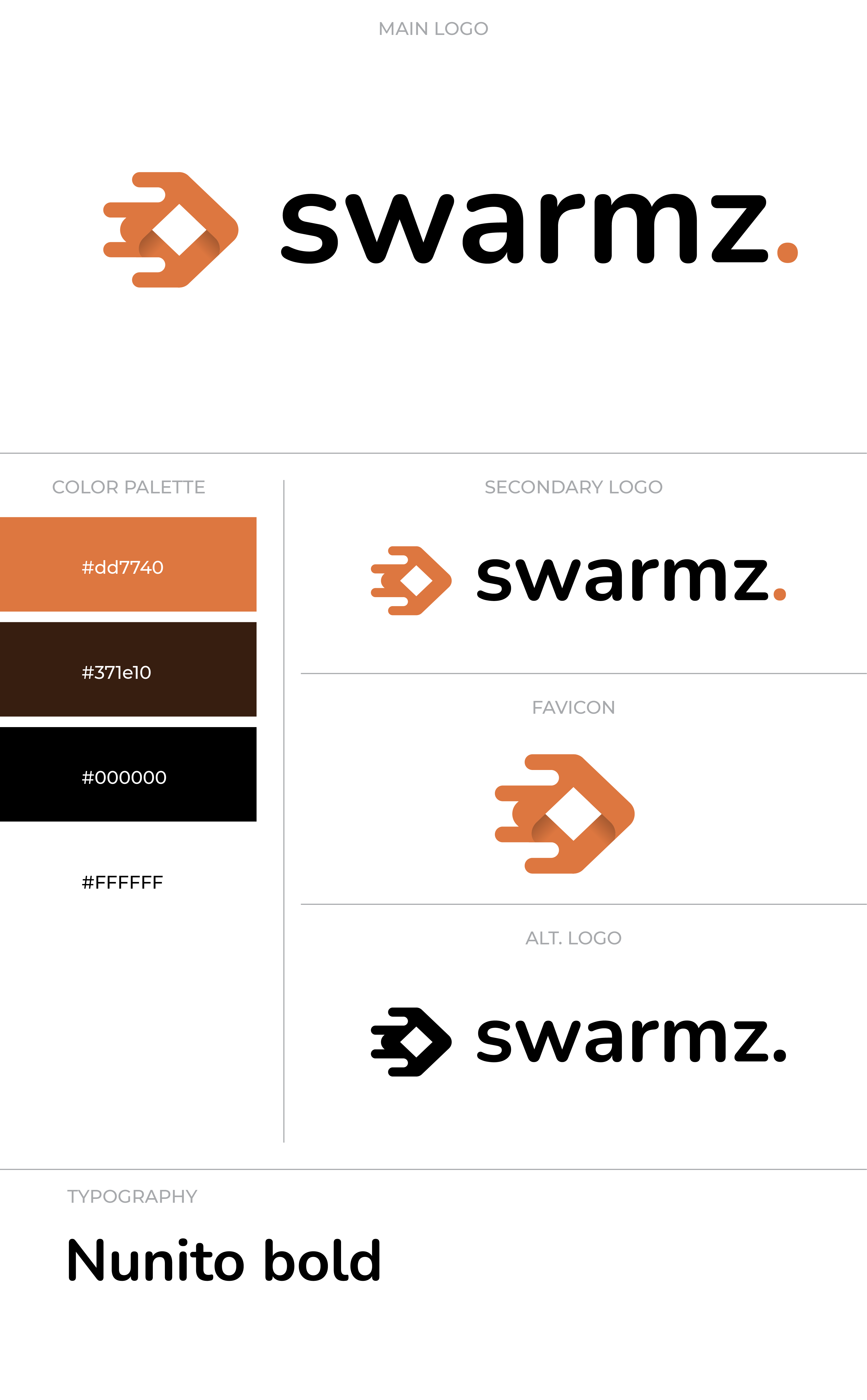
Lockup completo
Icona + wordmark.
Il marchio Swarmz ufficiale. Usalo nelle barre di navigazione, nelle slide di apertura, nei badge dei partner e ovunque conti la prima impressione. Il full color (3D) è la versione predefinita: scegli la variante per sfondo chiaro o scuro in base a dove va.
Icona
Il marchio, da solo.
Usala quando lo spazio è poco o il wordmark è già presente nella pagina. Full color 3D per i contesti hero, bianco/nero piatto per tutto il resto.
Solo testo
Solo "swarmz." — per gli spazi stretti.
Usalo solo quando l'icona duplicherebbe visivamente qualcosa lì vicino (per esempio una matrice di integrazioni che ha già una sua riga di marchi).


Vetrina
Mockup 3D + tavola di costruzione.
Usa il rendering 3D per gli scatti hero, i press kit e le pagine partnership. La tavola di costruzione documenta la griglia su cui è costruita l'icona.

Colore
Arancione bruciato, quasi nero, crema.
Il marchio vive in tre pesi: full color (la fioritura), monocromatico bianco (su scuro), monocromatico nero (su chiaro). L'arancione non si tocca — non ricolorarlo.
Uso
Qualche regola ferrea.
La tavola di costruzione (vedi le guide del logo qui sopra) copre la geometria. Queste sono le cose da fare e da non fare di tutti i giorni quando inserisci il marchio in una presentazione, un documento, un sito partner o un post social.
Use the icon at minimum 24×24 px to keep the swarm legible.
Keep clearspace equal to the dot's diameter on all sides.
Pair the white wordmark with dark backgrounds; black wordmark with light.
Use the orange dot as the brand accent on any monochrome wordmark.
Don't recolor the orange — #DD7740 only. No tints, gradients, neon variants.
Don't rotate, skew, or stretch the mark. Keep proportions exact.
Don't add drop shadows, glows, or strokes around the mark.
Don't substitute fonts in the wordmark — use the SVG/PNG, never re-typeset.
Domande frequenti
Domande frequenti sull'uso del brand Swarmz.